SACRAMENTO PUBLIC LIBRARY


SUMMER READING 2026
Sacramento Public Library
DESIGN STRATEGY FOR SUMMER READING PROGRAM 2026
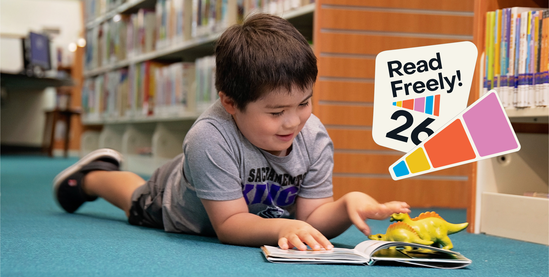
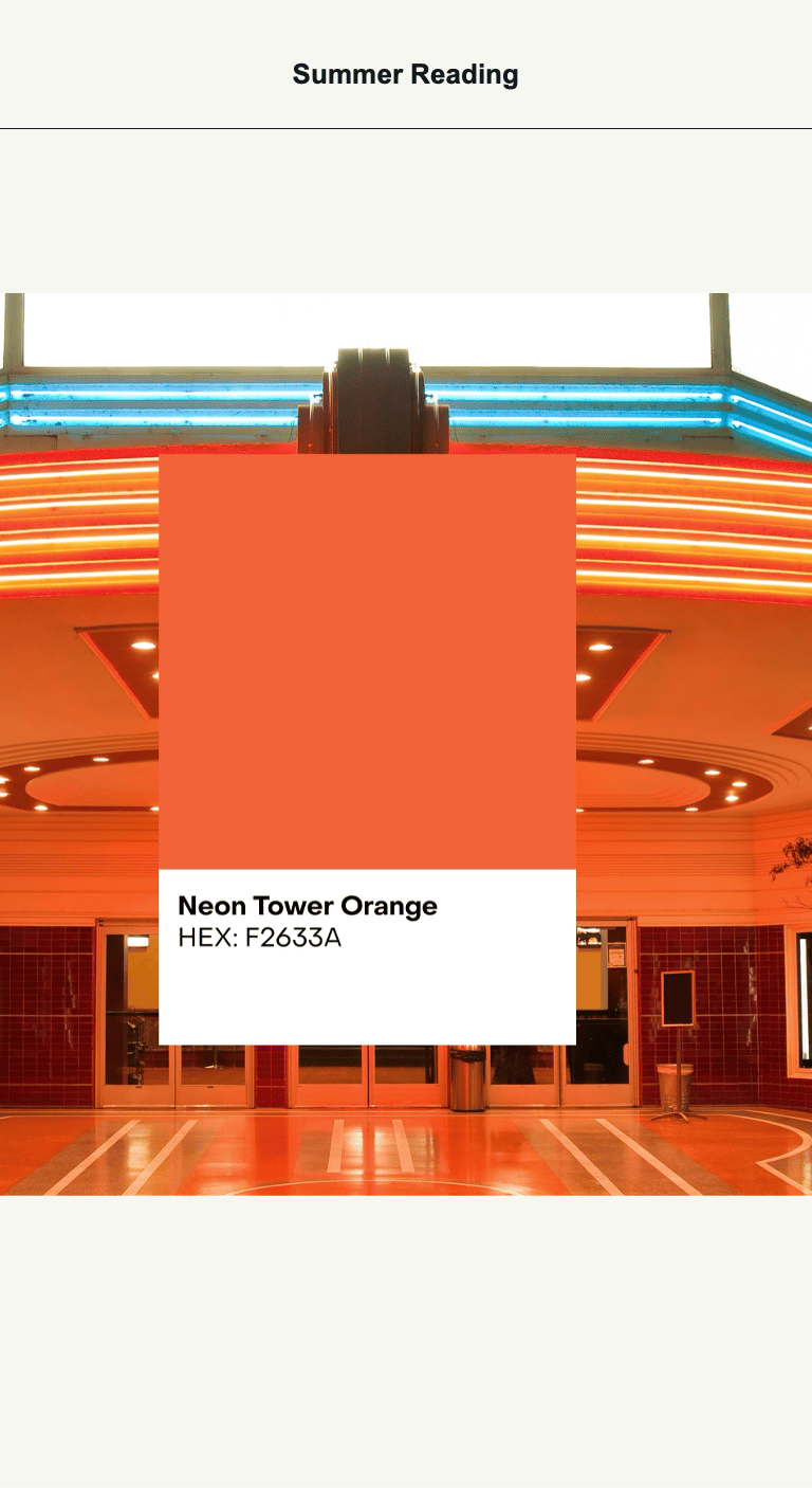
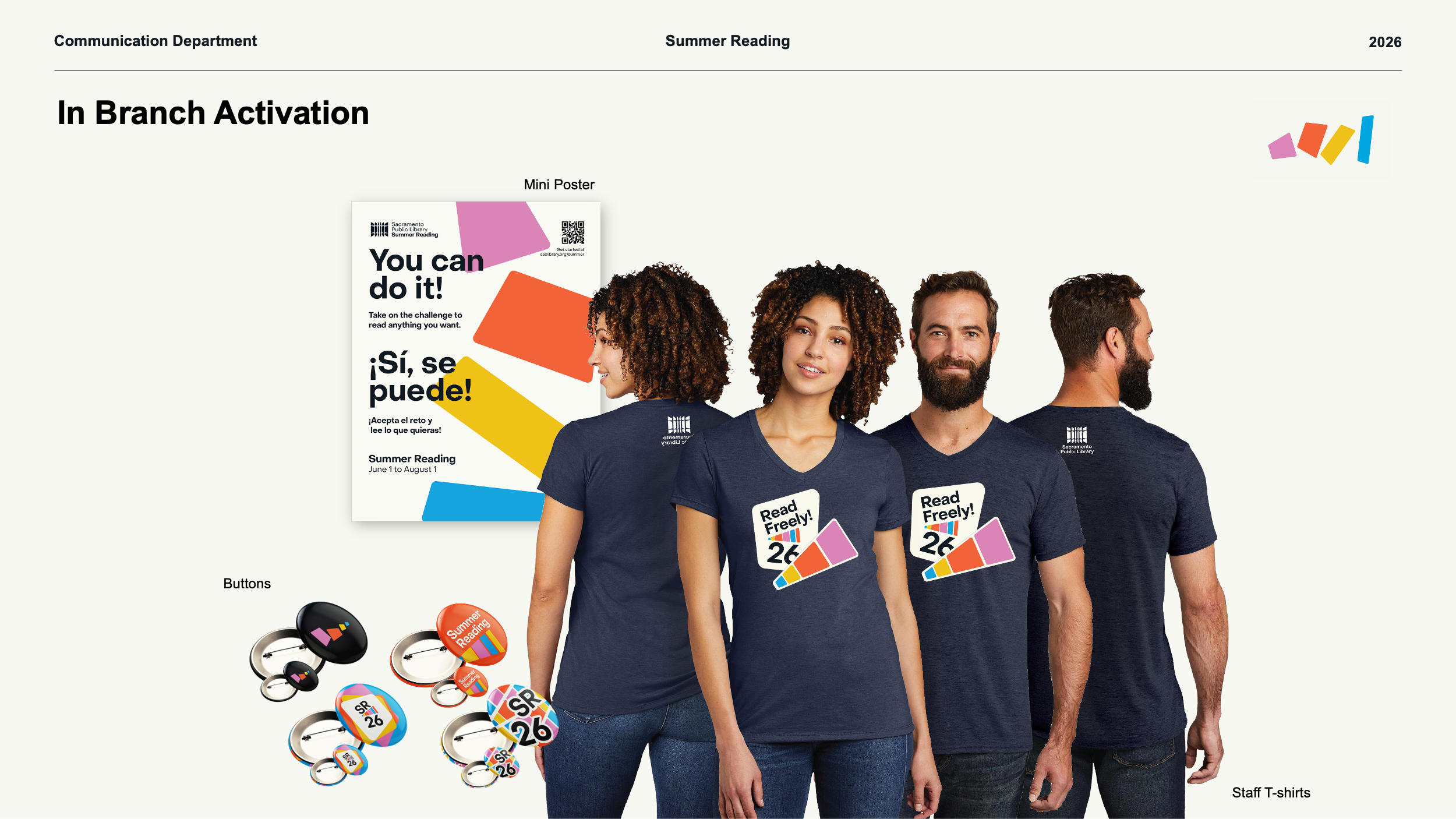
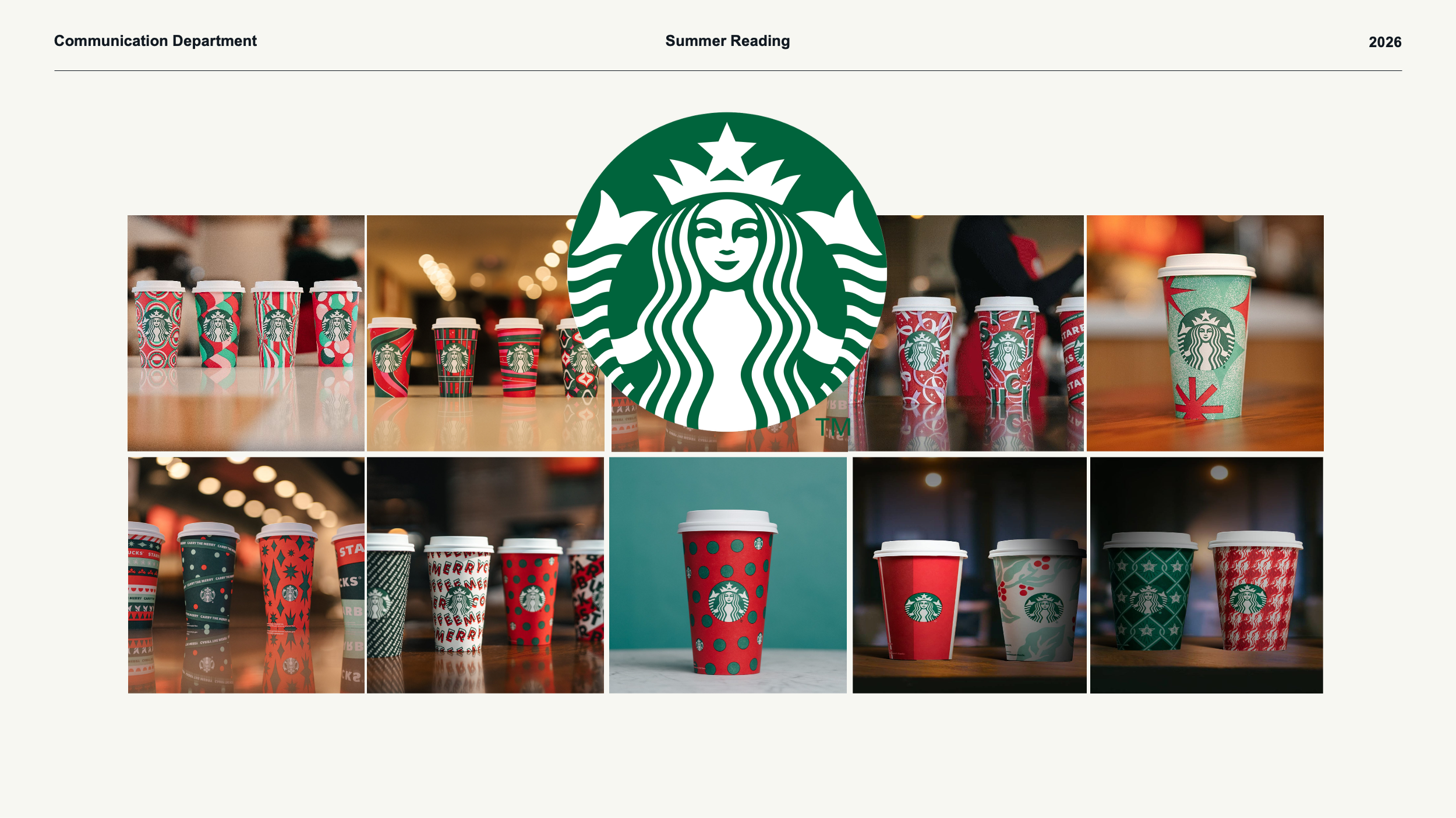
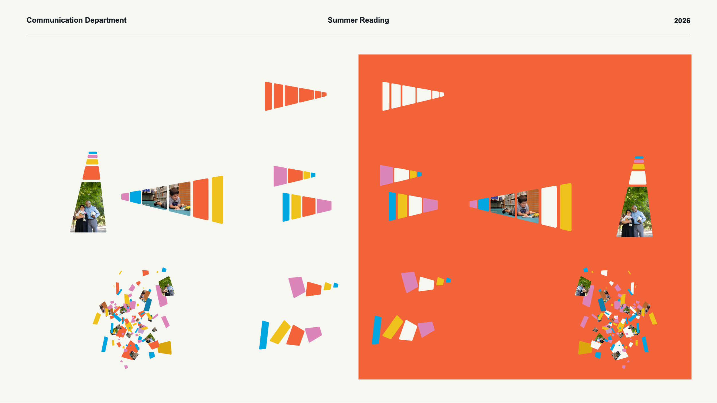
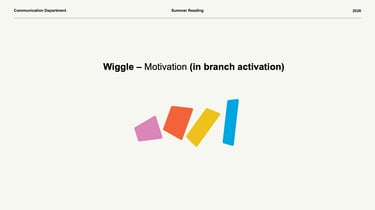
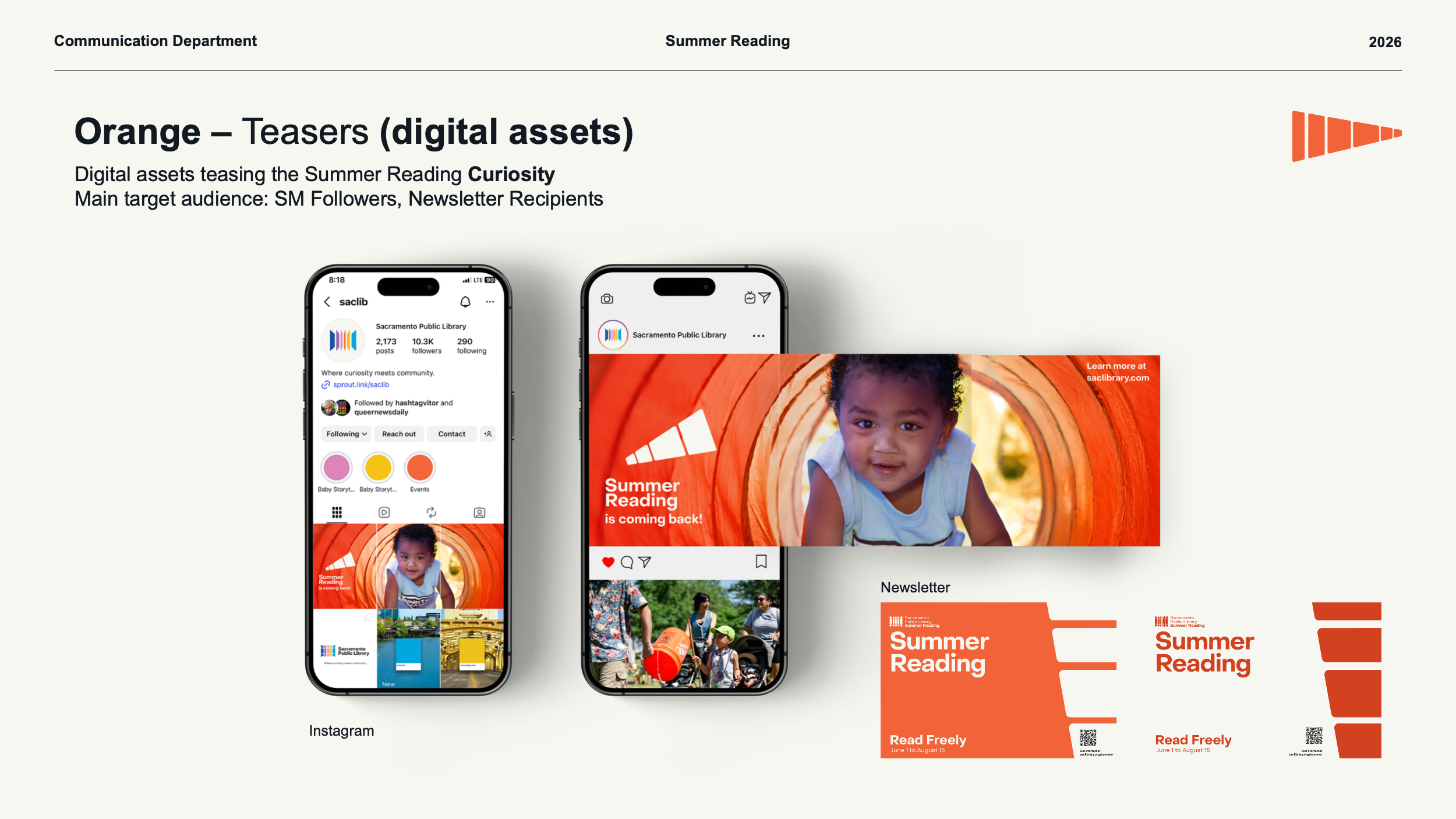
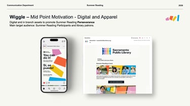
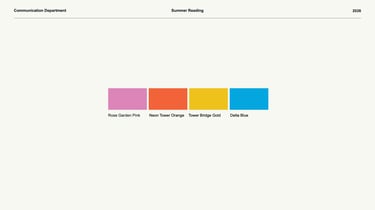
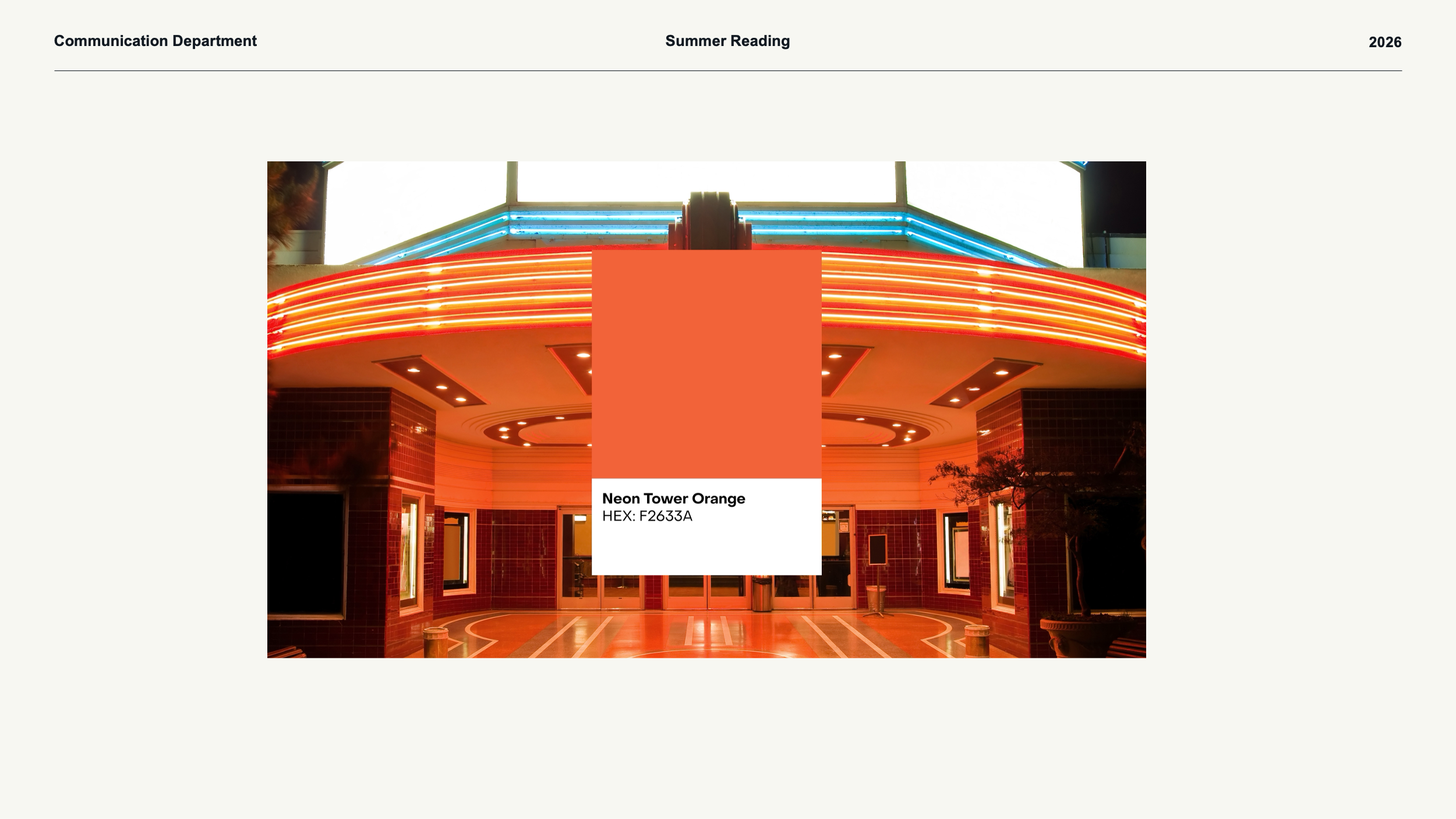
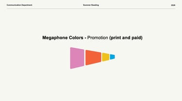
Design: A vibe, not a logo – like Starbucks holiday cups creating an environment, not a single image. The summer team chose the anchor: Neon Tower Orange and the megaphone shape. We honored that, then grew it – adding the other three colors (Rose Garden Pink, Tower Bridge Gold, Delta Blue), then photos of real staff and community, then the Wiggle (same elements shaking) to keep energy flowing across two months.
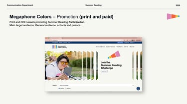
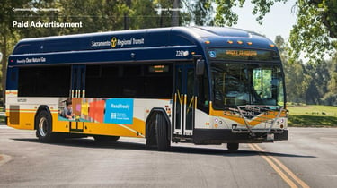
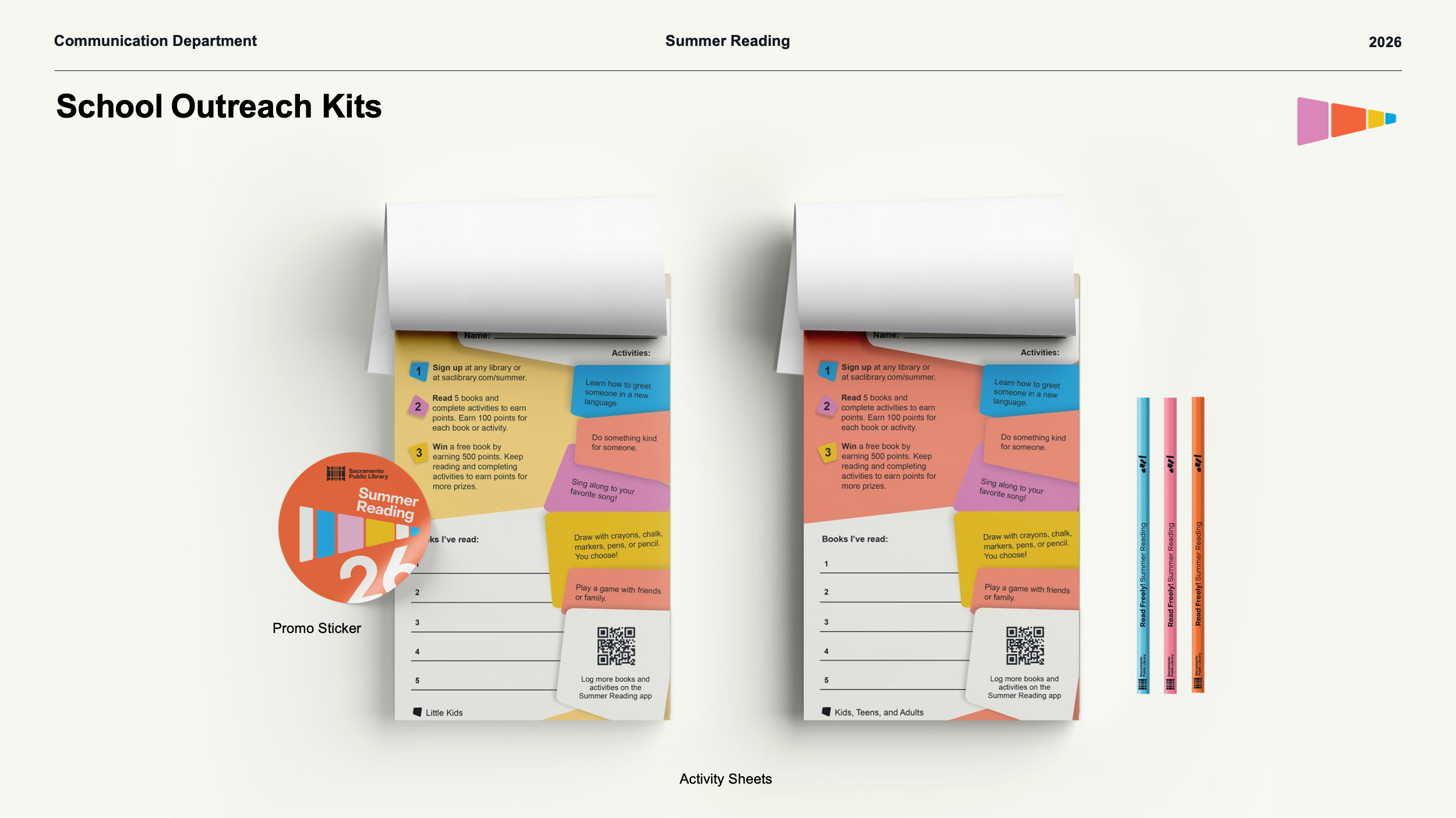
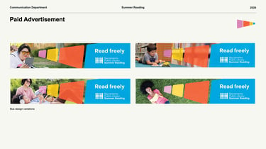
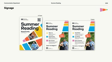
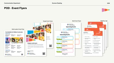
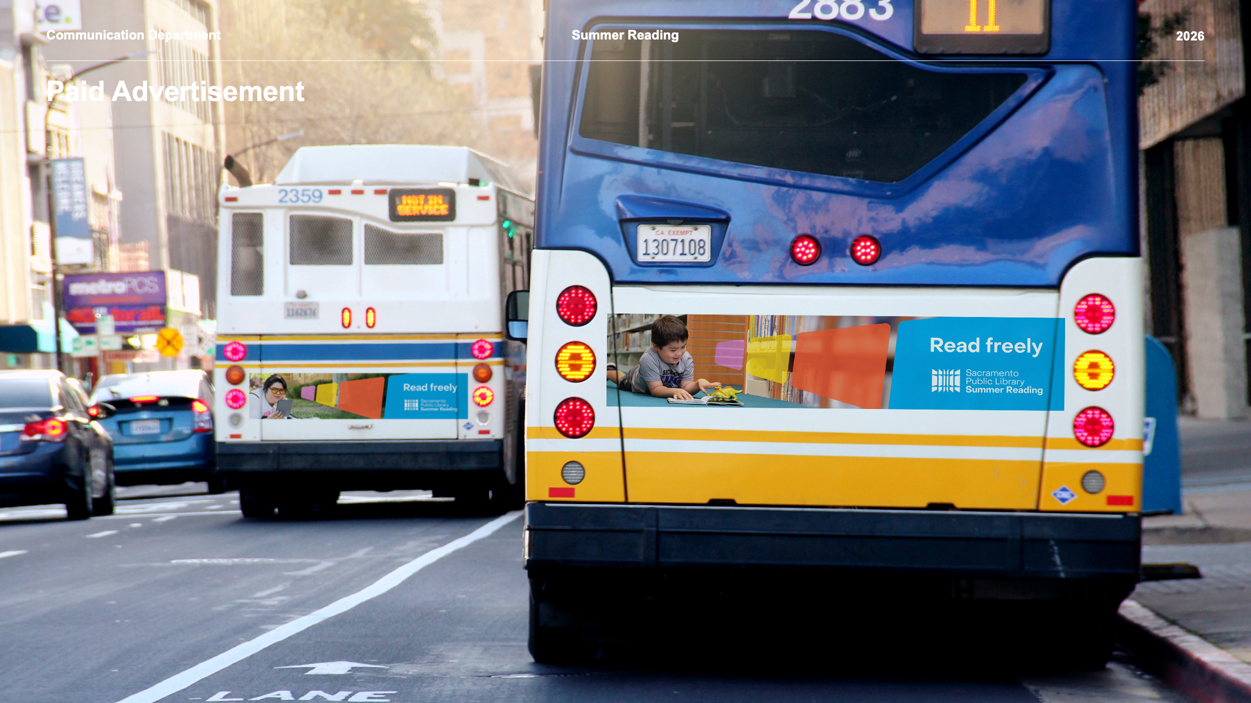
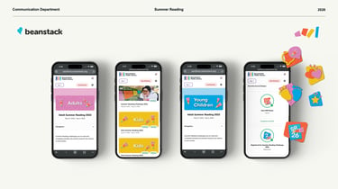
Marketing: Reach families where they are: digital teasers, social media, newsletter, Beanstack, out‑of‑home (buses across the city), in‑branch A‑frames and posters, print‑on‑demand flyers (multi‑location, single event, multi‑event), reading logs, prize flyers, promo stickers, color‑changing pencils, activity sheets (English/Spanish), t‑shirts, buttons, mini‑posters ("You can do it / Sí se puede"). Every asset in bilingual.
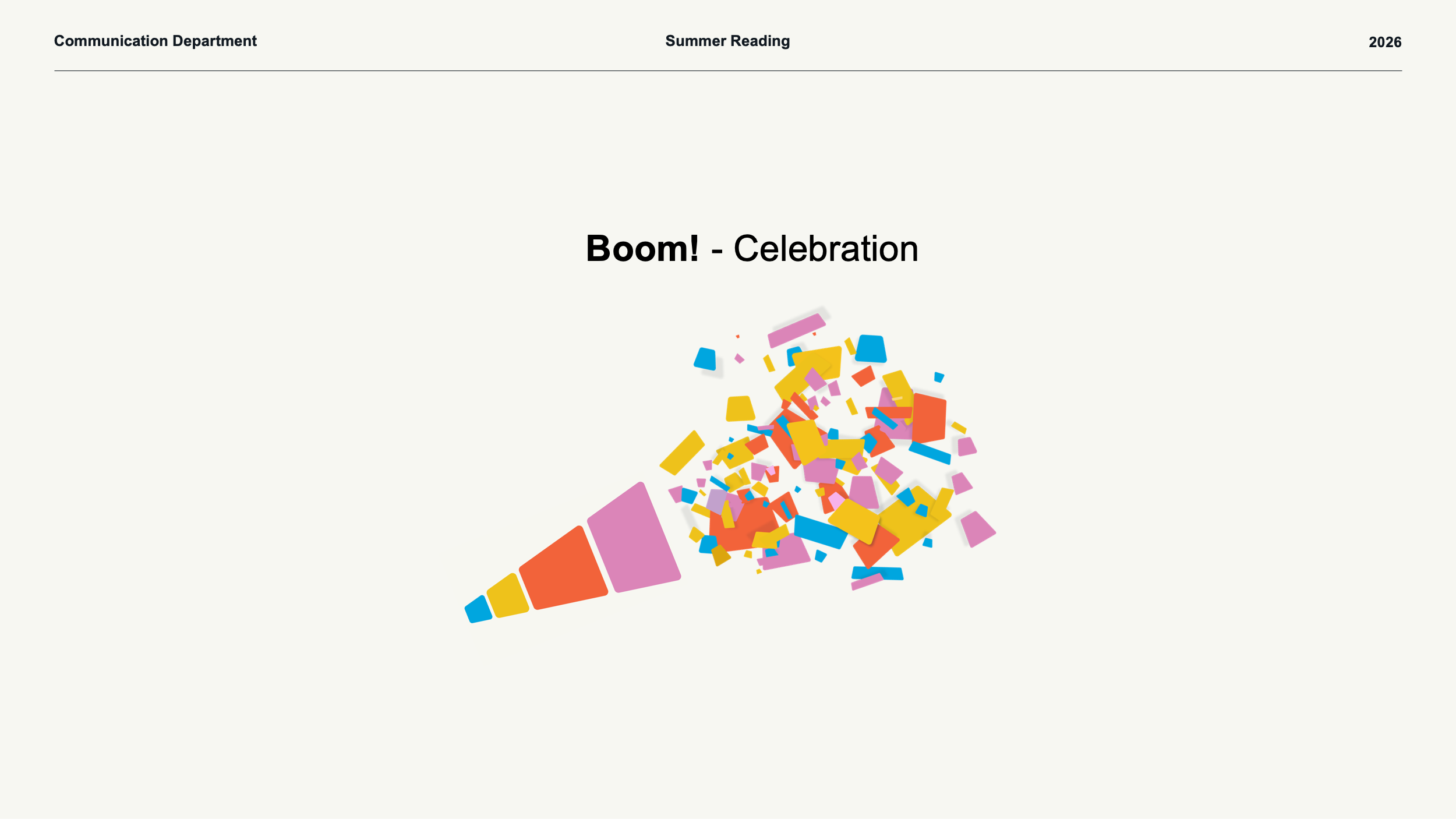
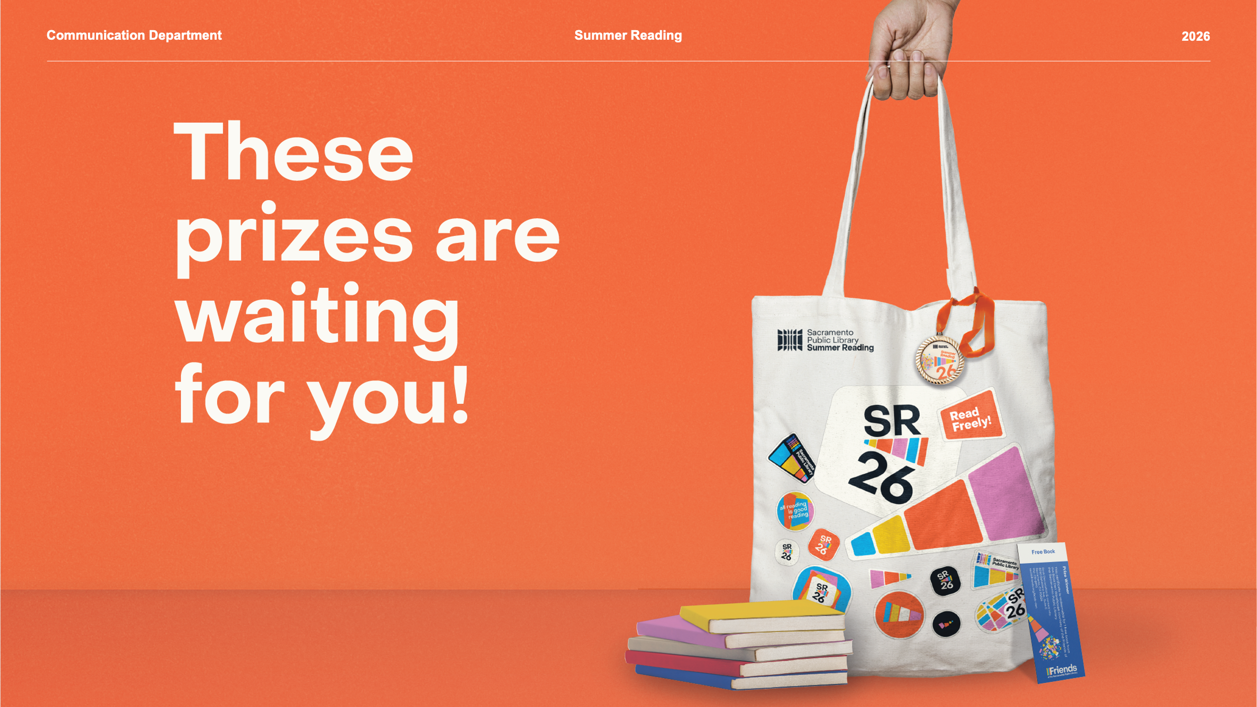
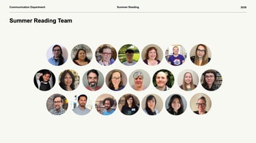
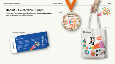
Storytelling: "Where curiosity means community" – the tagline that drives everything. Summer reading as a shared environment, not a program. The megaphone in orange says "you're part of this." The Wiggle says "keep going." The celebration (medal, tote bag, adult book prize coupon) says "we did it together." Real people in the photos so the community sees itself.
Project Mgmt: Co‑created with the summer reading team – they chose orange and the megaphone; we built the rest. Coordinated two months of production: print‑on‑demand, out‑of‑home vendors, Beanstack digital integration, bilingual translation. The Wiggle as a planned mid‑campaign energy boost. Every asset aligned to the same environment, not a checklist.
(Design + Marketing ÷ Storytelling) × Project Management =
For Summer Reading 26 the team chose the seed. We grew the environment. The community saw itself and kept moving – all the way to the boom.
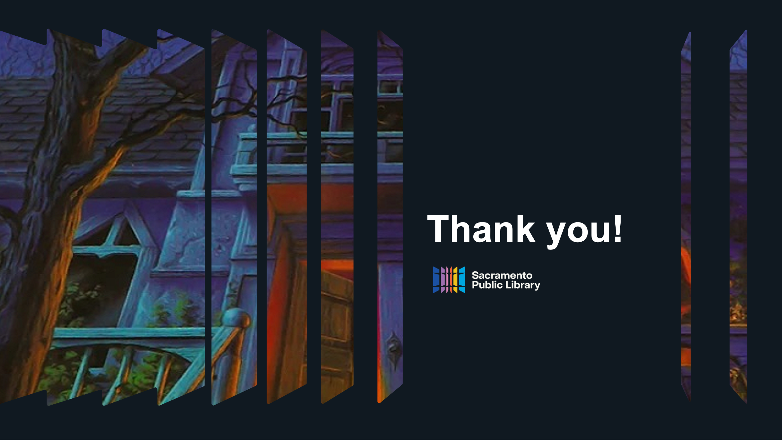
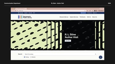
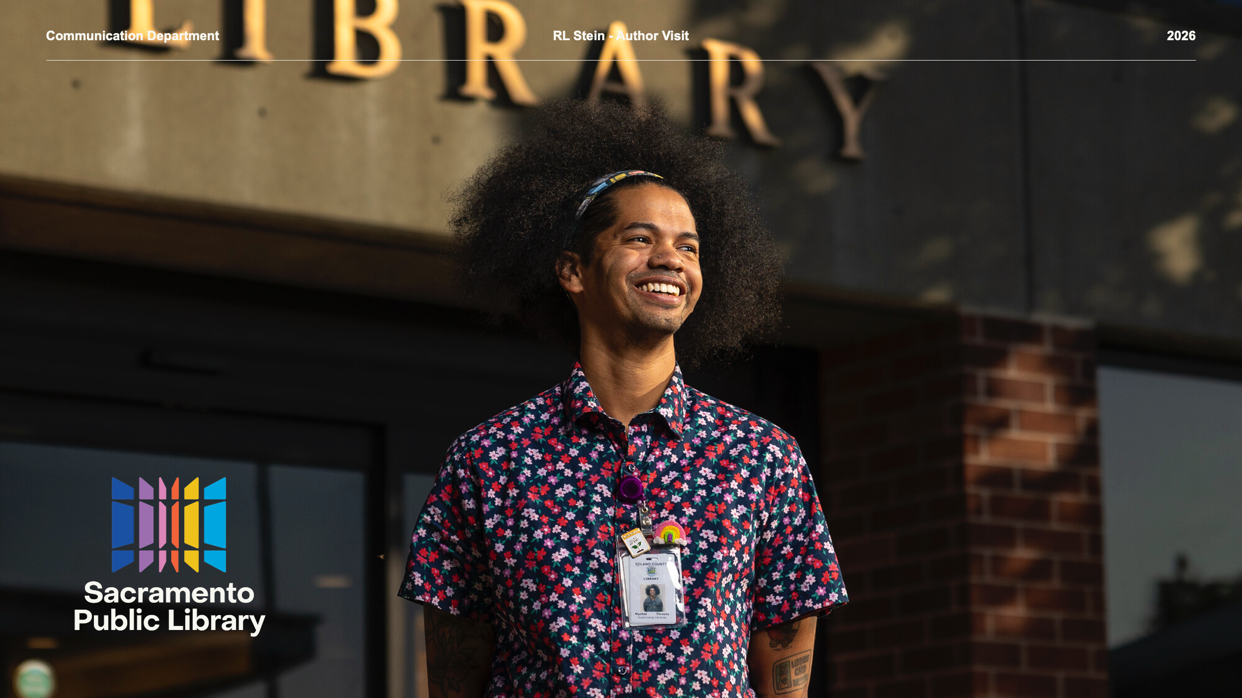
R. L. STINE 2026
Sacramento Public Library
CREATIVE DIRECTION FOR AFFORDABLE HOUSING DEVELOPMENT
Design: A warm and inspiring visual system anchored on a flower motif symbolizing the bloom of community. Paneled walls (common in affordable housing) became our white canvas. From there, a rose curve (spirograph‑generated) and a color palette carrying the design team's hopes into every corner.
Marketing: A low‑budget project with a high‑impact solution. Budget shifting and efficiency through collaboration – architects, landscape designers, FF&E, art specialists, and more. The result? A 360° design that feels premium on a tight budget.
Storytelling: Robert Rauschenberg's White Painting as our starting point: a blank slate awaiting the bloom of community and its creators. Every choice nurtured the conditions for residents to flourish, not just inhabit.
Project Mgmt: Buy‑in between partners was key – an open‑minded developer willing to shift budget toward creative needs. We were building a home. Nurturing future homes. Recognized as a 2025 AHF Readers' Choice Awards Family Finalist and a 2025 DJC Top Project – an incredible feat for such a small‑budget development.
(Design + Marketing ÷ Storytelling) × Project Management =
Las Flores is proof that collaborative efforts create the conditions for a blooming community even in dire situations.
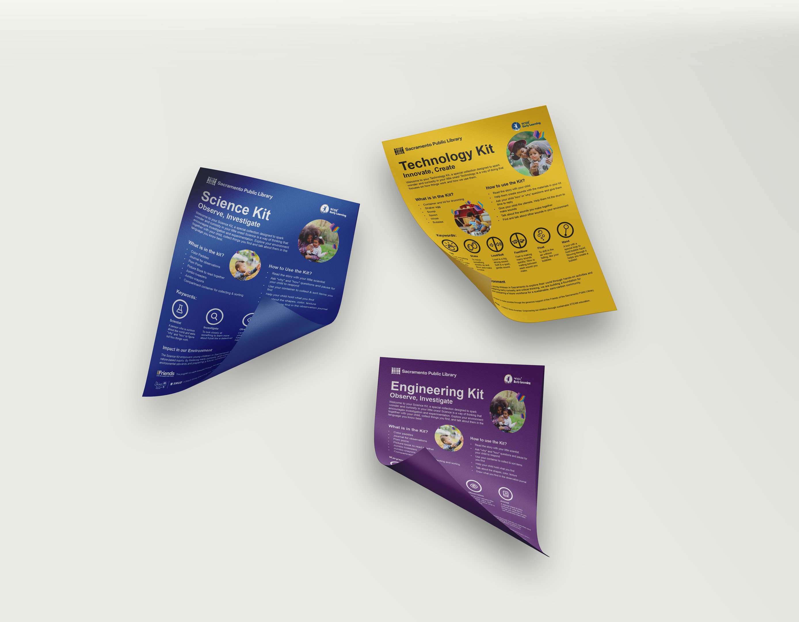
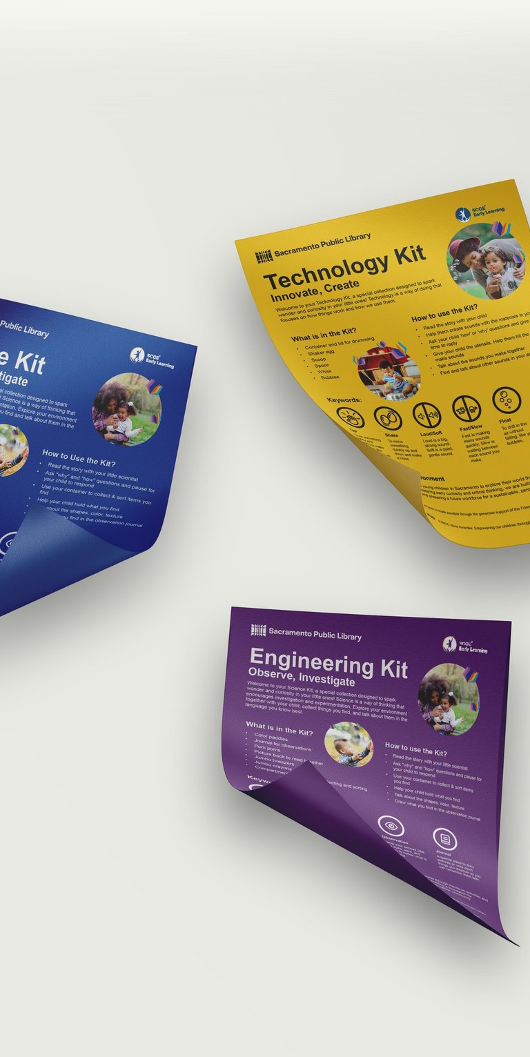
EARLY LEARNING STEAM
Sacramento Public Library
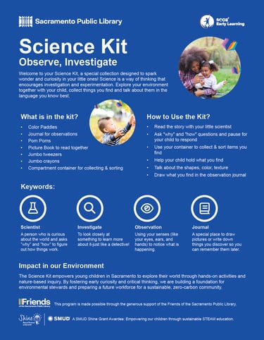
(Design + Marketing ÷ Storytelling) × Project Management =
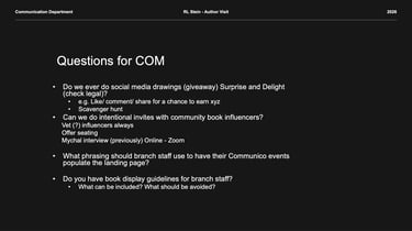
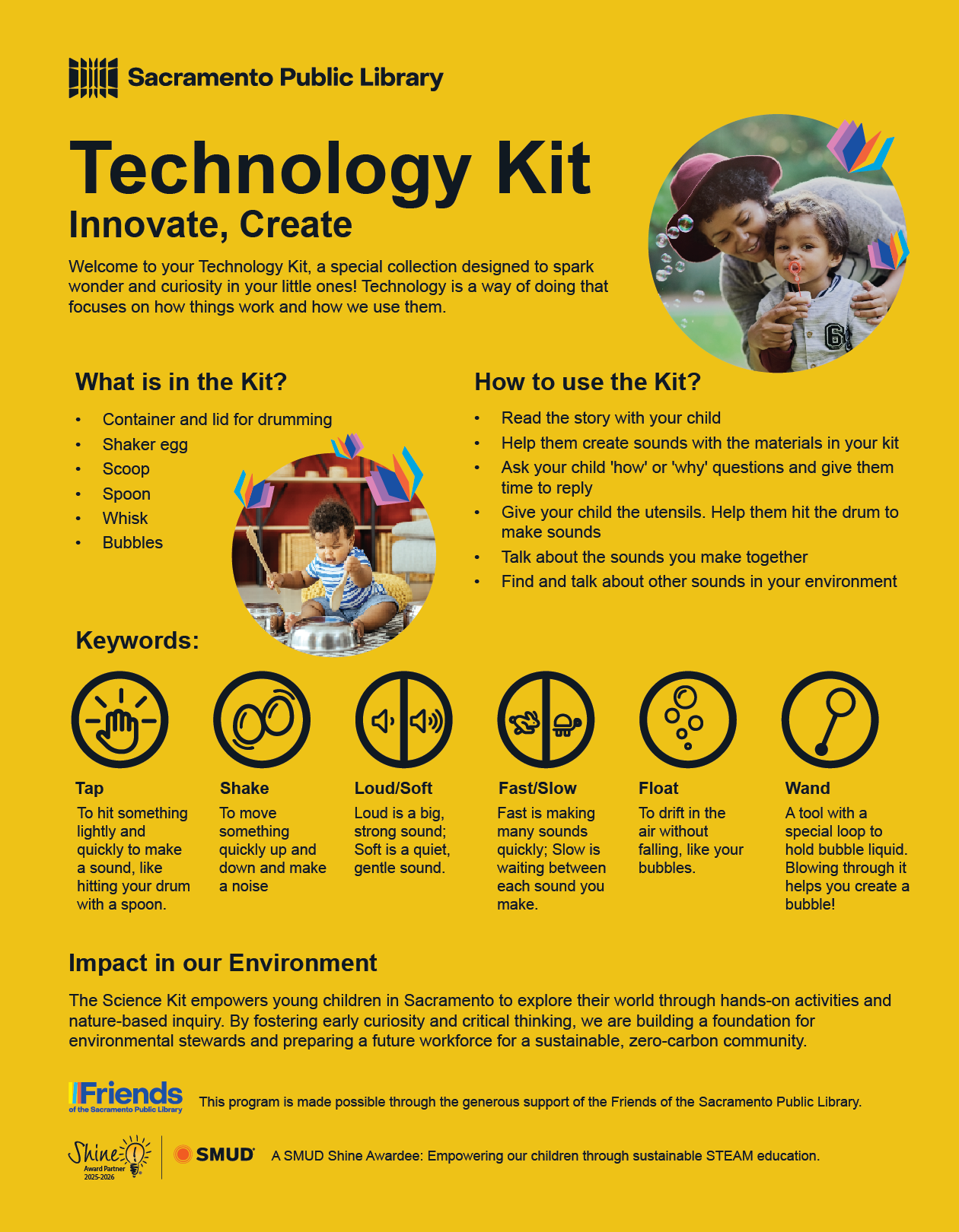
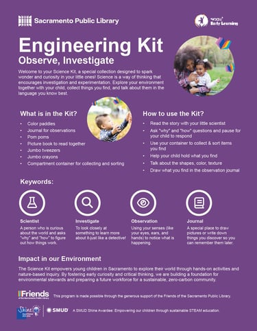
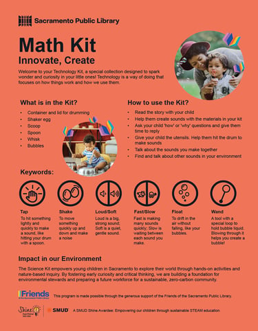
Program & Communication Design Strategy for a free, equitable STEAM toolkit for caregivers. Project led by Nate Halsan at Sacramento Public Library with support from SCOE Early Learning and as a SMUD Shine awardee. Every child, regardless of means, gets to build, play, and wonder.
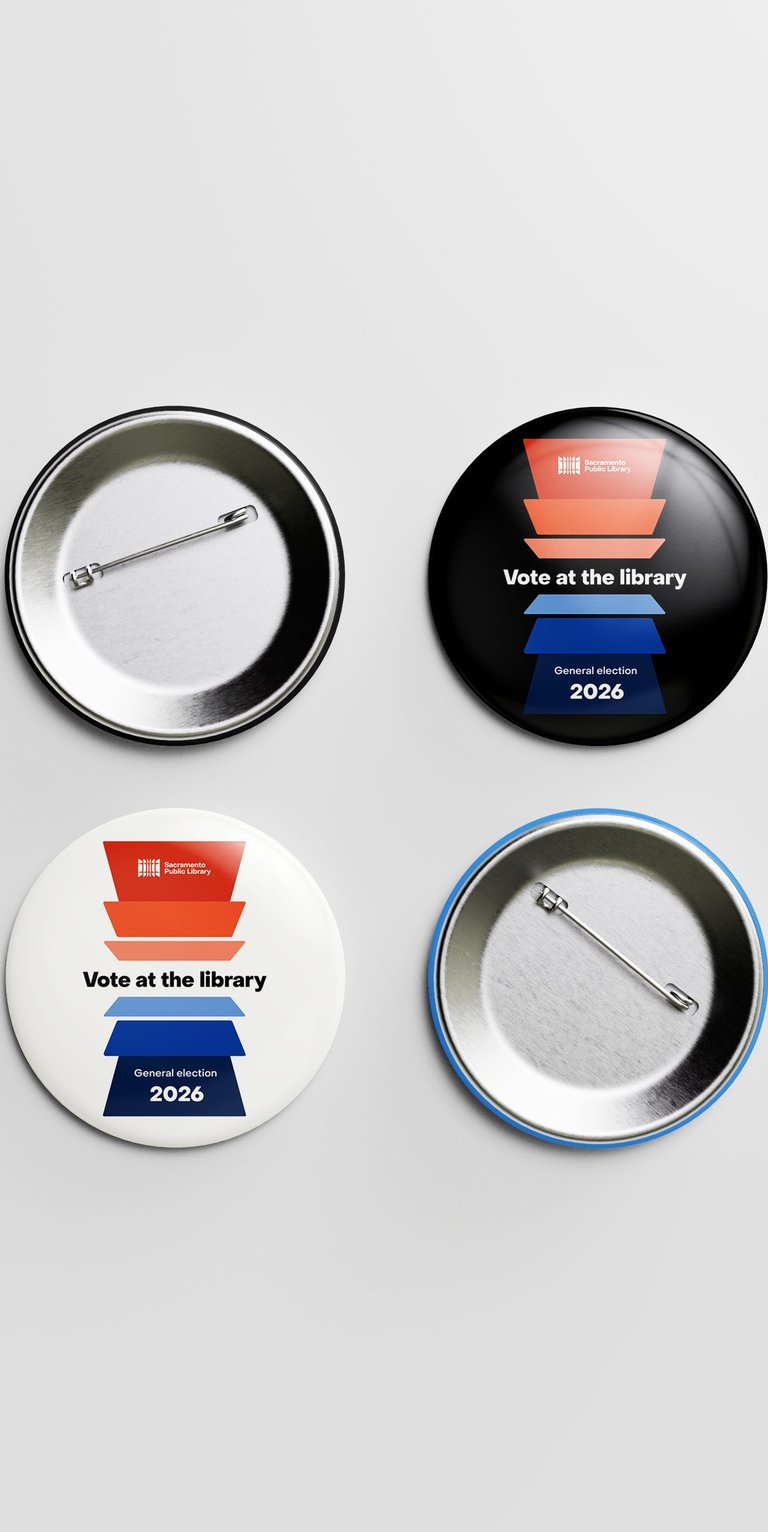
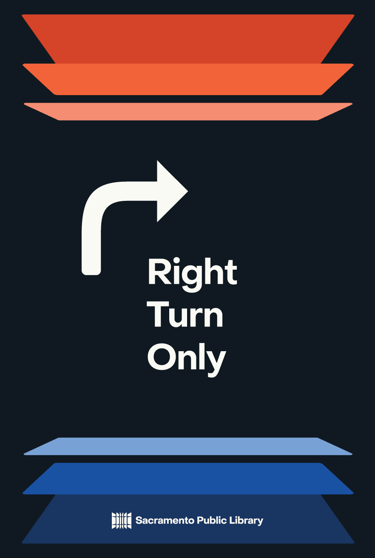
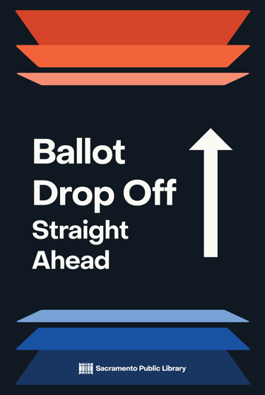
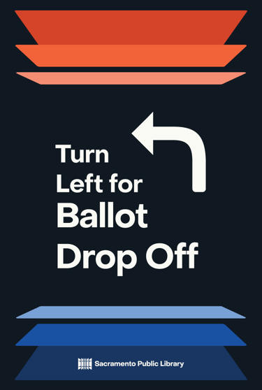
VOTE AT THE LIBRARY
Sacramento Public Library

(Design + Marketing ÷ Storytelling) × Project Management =
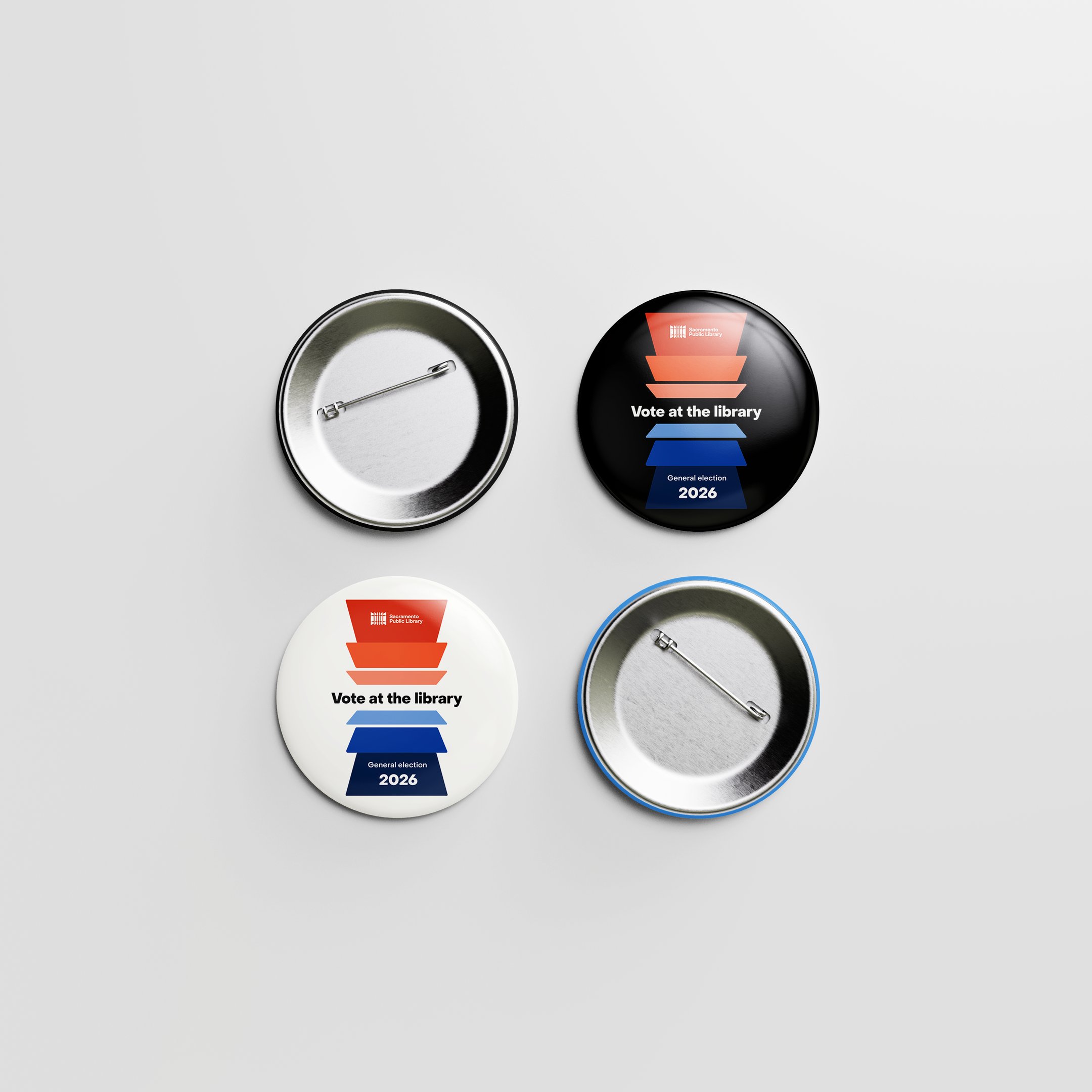
A visual identity for Vote at the Library – built on brand direction from Pastilla Design Agency and extended into drive‑through signage, multilingual communications (Spanish, Farsi), and the iconic Vote at the Library button. Every voice gets a clear, welcoming path to the ballot.
VITOR BASTOS
© 2026. All rights reserved.