
COMMUNITY
DEVELOPMNT
PARTNERS


LAS FLORES
CDP Community Dev. Partners
CREATIVE DIRECTION FOR AFFORDABLE HOUSING DEVELOPMENT
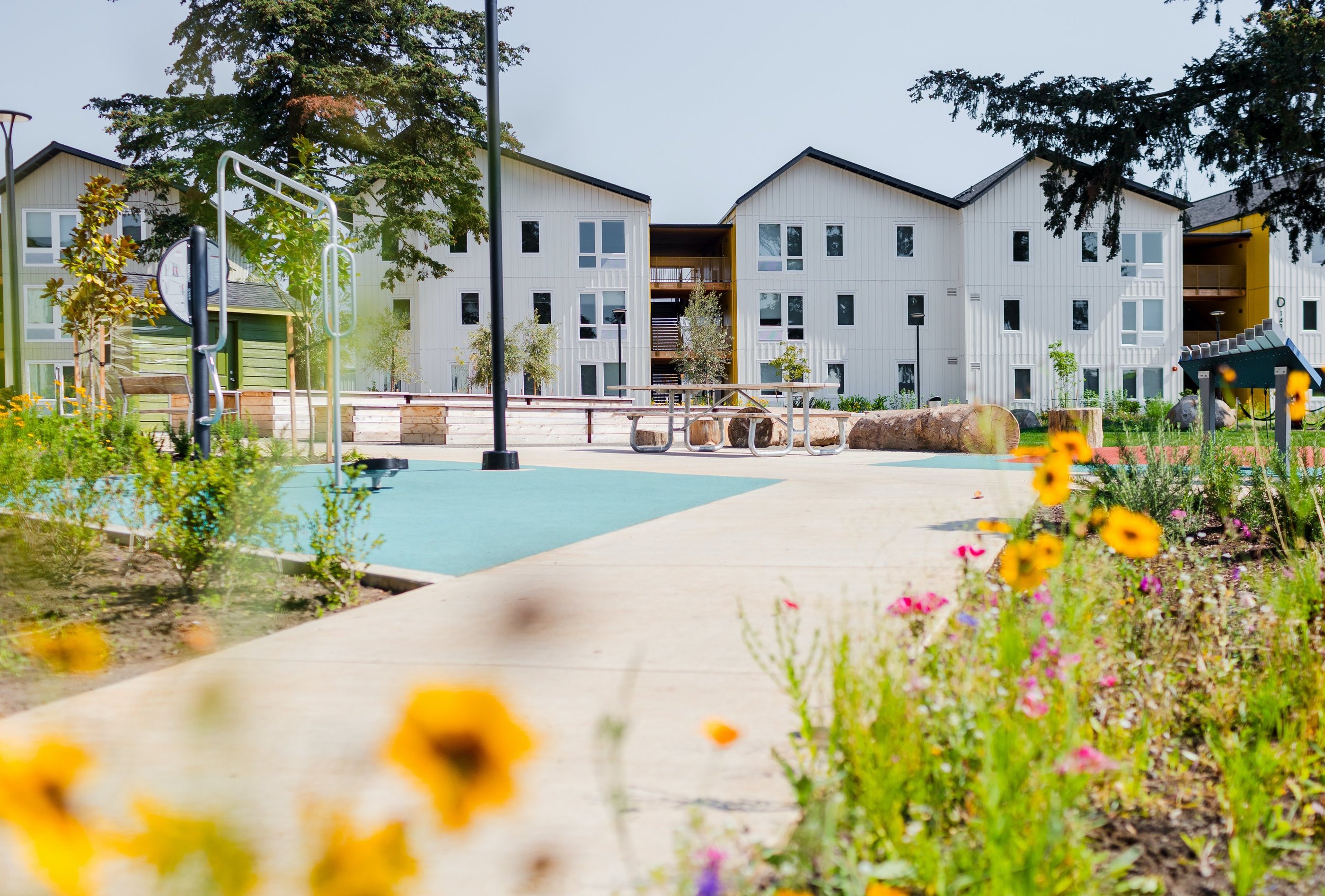
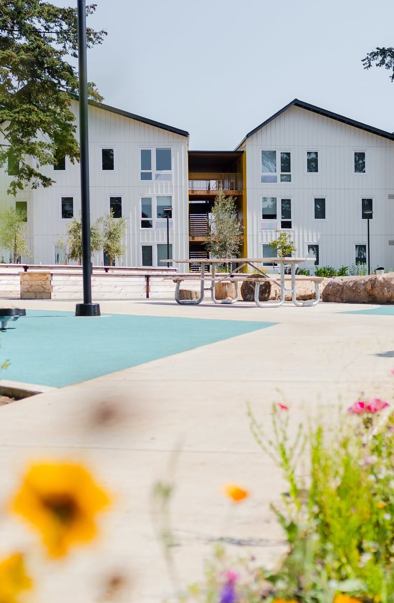
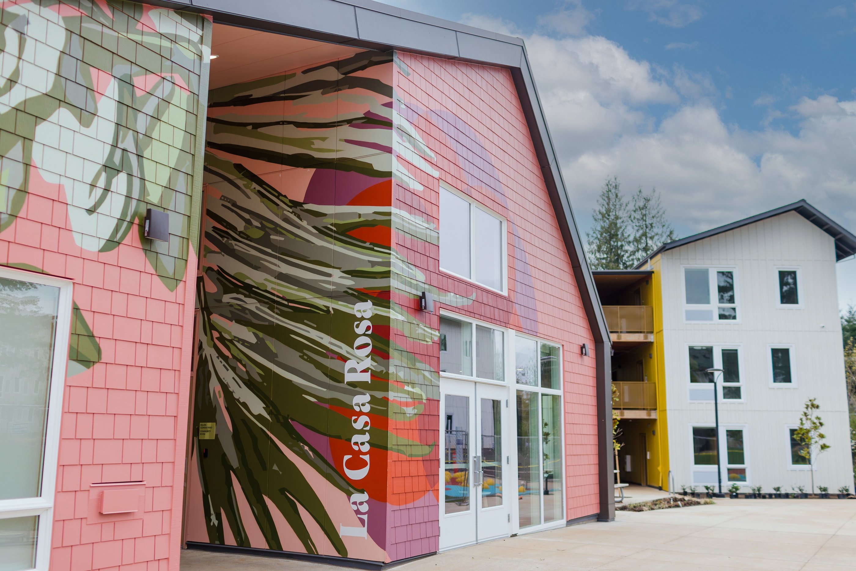
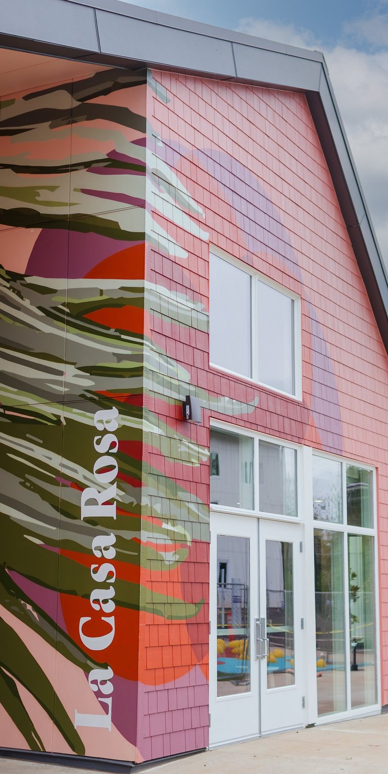
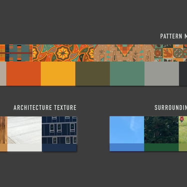
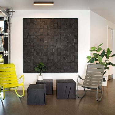
Design: A warm and inspiring visual system anchored on a flower motif symbolizing the bloom of community. Paneled walls (common in affordable housing) became our white canvas. From there, a rose curve (spirograph‑generated) and a color palette carrying the design team's hopes into every corner.
Marketing: A low‑budget project with a high‑impact solution. Budget shifting and efficiency through collaboration – architects, landscape designers, FF&E, art specialists, and more. The result? A 360° design that feels premium on a tight budget.
Storytelling: Robert Rauschenberg's White Painting as our starting point: a blank slate awaiting the bloom of community and its creators. Every choice nurtured the conditions for residents to flourish, not just inhabit.
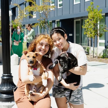
Project Mgmt: Buy‑in between partners was key – an open‑minded developer willing to shift budget toward creative needs. We were building a home. Nurturing future homes. Recognized as a 2025 AHF Readers' Choice Awards Family Finalist and a 2025 DJC Top Project – an incredible feat for such a small‑budget development.
(Design + Marketing ÷ Storytelling) × Project Management =
Las Flores is proof that collaborative efforts create the conditions for a blooming community even in dire situations.
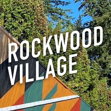
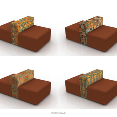
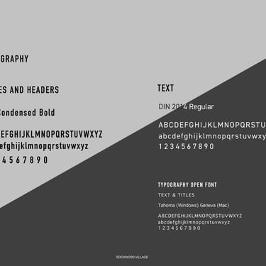
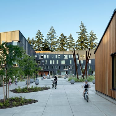
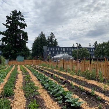
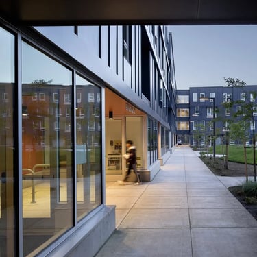
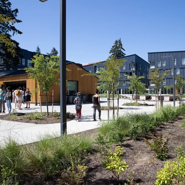
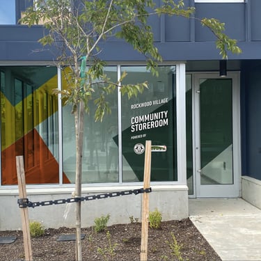
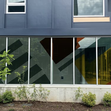
ROCKWOOD VILLAGE
CDP Community Dev. Partners
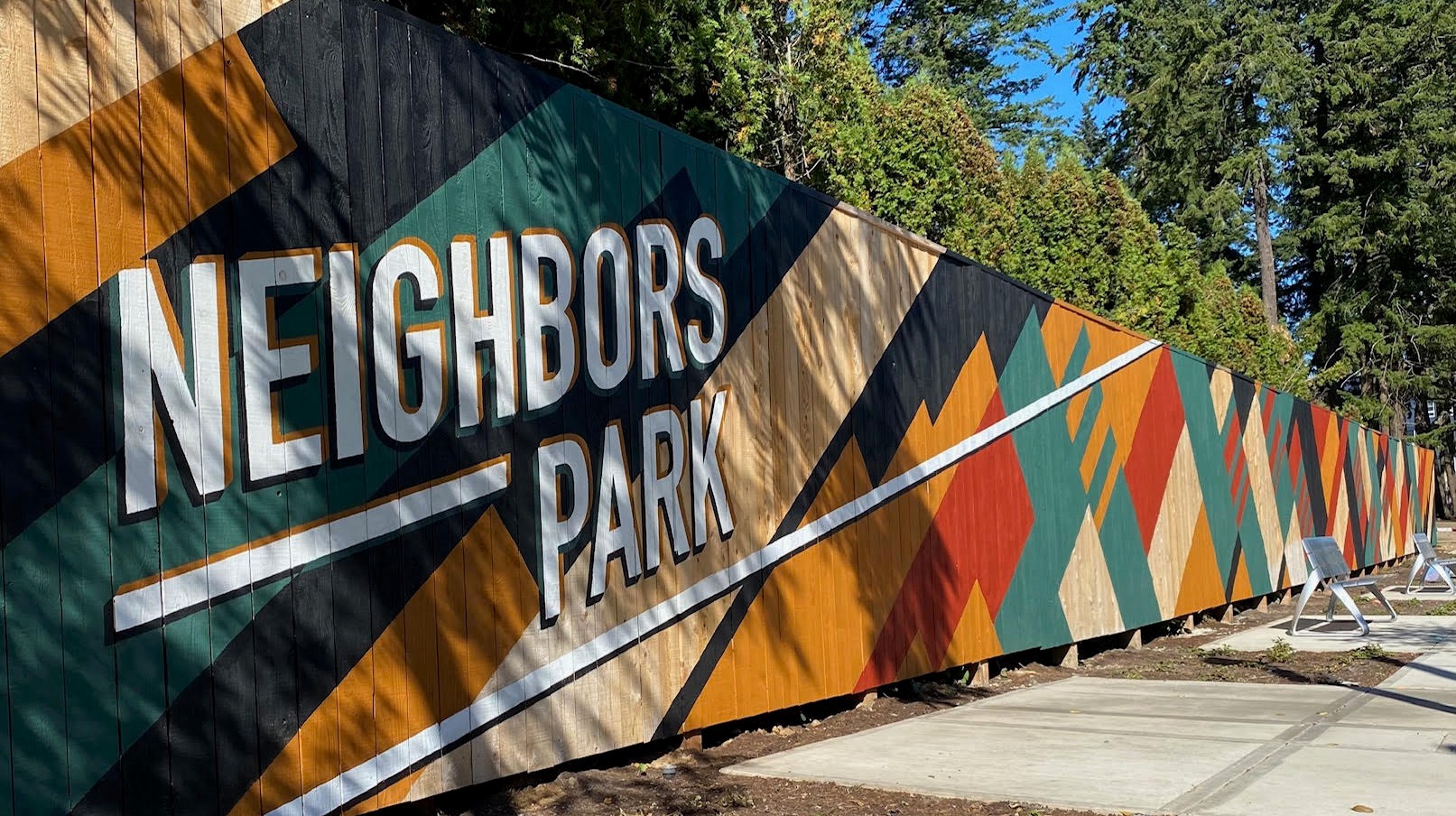
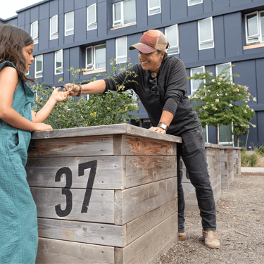
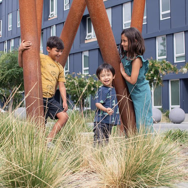
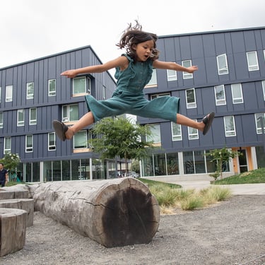
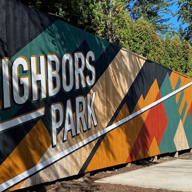
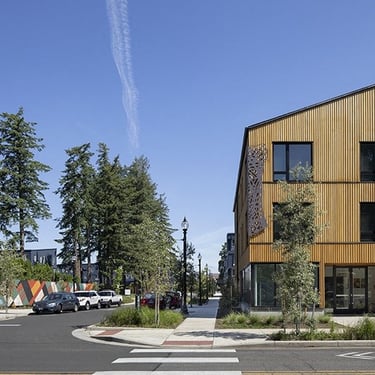
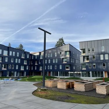
BRANDING FOR AFFORDABLE HOUSING PROJECT
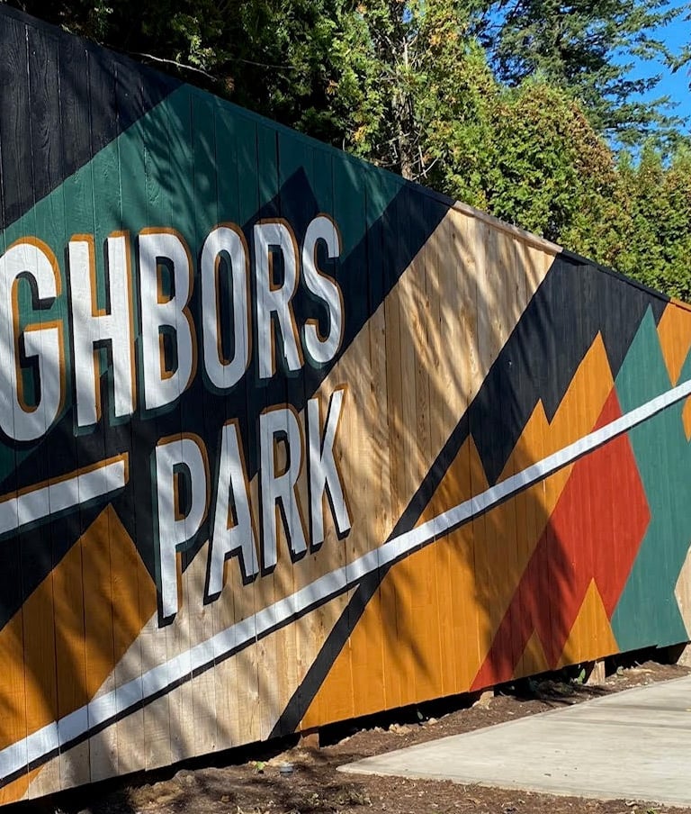
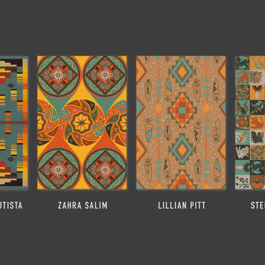
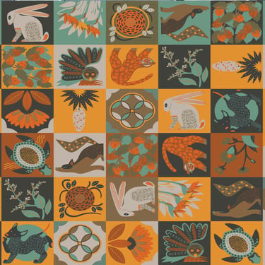
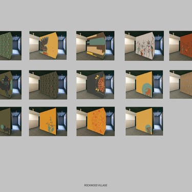
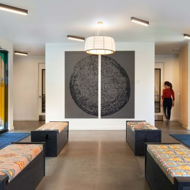
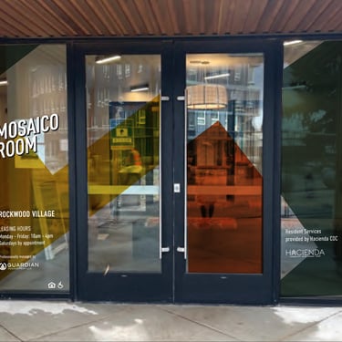
Design: Four local designers, one color palette – patterns for wallpapers and fabric‑wrapped furniture. My role was to create a simple, unifying design for the brand, font, logo, signage, color rules.... And design assets, oversized graphics rising out of frame represented around the development– on signage, artworks and vinyl clings inspired by stained glass. Always gigantic. Always ascending.
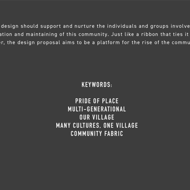
Marketing: The common thread arriving at the end of the process: wrapping four distinct creative directions into one cohesive, community‑focused proposal that the developer and future residents could instantly recognize as theirs.
Storytelling: A rising community. A slanted, rising logo – will and goals angled upward. Oversized elements climbing out of frame, never contained.
Project Mgmt: Studied the earlier collaborations between developer and local designers to understand their creative DNA. Partnered to honor, not override – ensuring every new asset (logo, signage, vinyl clings) extended what already existed. The result: a unified brand that felt co‑owned by everyone from the start.
(Design + Marketing ÷ Storytelling) × Project Management =
Rockwood Village rises together.
Lewis Mumford
The first human tool was the mind:
the idea of a Megamachine is the human mind at scale.
VITOR BASTOS
© 2026. All rights reserved.
DESIGN STRATEGY